We started by understanding the source of the data (census APIs) by going through the documentation provided by the census website. Each variable had different dataset and different data structures. Understanding how to access each variable was first step towards success. It took quite amount of time to go through all the variables’ access points and find patterns in it
We studied all the variables and tried to envision how each variable can be displayed using various charts provided by d3. At first every variable looked similar and seemed like it can be visualized using bar chart, but after contemplating on them, we came up with other charts which were perfect fit for the given variables. Below image displays the brainstorming we did in the starting phase.
Next step was to arrange the charts in a manner which would be aesthetically pleasing and deliver a good user experience. Our main aim was to remove all the hassles for accessing the variables; we achieved them by making choices which were more suitable for the function. We tried to eliminate the dropdown menus as much as possible. For accessing all the variables at once we provided a side menu bar less with variables and their relevant icons, so that user would get information about all the available variables he/she can play with. Wherever possible we tried to avoid dropdowns, but wherever it wasn’t, we provided a search feature for all dropdowns, so that user can select a particular variable by typing it’s name.

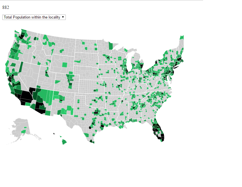
First decision was to choose which level of data we need to display; do we need to display state level data or county level data? After analyzing the data we got from census, we found that we are not getting data for every county. We were only getting the data for few counties, so for showing few variables like total population within the locality didn’t make any sense if showed on state level as a particular state’s all counties data was not provided.
There were too many variables and information to be visualized, as complex as it was to visualize, same amount of complexity was to interpret the visualization at once. At first we thought to display different variables on different pages, but user would get easily lost by the overwhelming information spread over different pages, so we finalized of providing only one page, which would display all the variables on it. And that was the biggest challenge we faced, providing enormous amount of visualized data only one page.
For overcoming the challenge, we gave users options to minimize irrelevant visualized charts and only to keep the charts that user is interested in. And keeping this user need in mind, we decided our design and coding strategy. For the minimizing irrelevant charts feature, we followed modular code strategy. Building each chart separately and building a separate data structure for each chart gave us the flexibility of achieving the challenge.
The charts we chose to display were decided based on which variable we are choosing to display. The relation between the variables and charts was the key point, because it wouldn’t make any sense showing county’s per capita income using a bar chart, as it was only one value for that particular county, it’d easier to show a with relevant icons as it is easier to envision. Similarly, it didn’t make any sense for showing a bar or pie chart for finding a trend or relation between two variables, as you had to incorporated two different variables with no timestamp given, although it can be displayed well using scatter plot.
After squeezing in most of the charts into one screens, we realized US map that we are showing is quite small. Hence a zoom function was provided